Work OutOut
Social events app · Flutter
Seven destinations, five slots, none of them buried.
OutOut is a shared-memory app for group outings: everyone at an event contributes photos, messages, place pins and expenses into one collective album that locks into a read-only "Memory" when the night ends. The navigation had more legitimate destinations than a bottom bar can physically hold. I treated it as a prioritisation problem rather than a layout one.
- Role
- UX & design systems, build and release
- Organisation
- AIENAI
- Period
- 2025
- Status
- Shipped
- Live
- outout.app
Built with
- Flutter
- Supabase
- EAS Build
- App Store Connect
64%
Less nav-related confusion in testing
7 → 5
Destinations held in a five-slot bar
App Store
Shipped and tracked post-release
The constraint
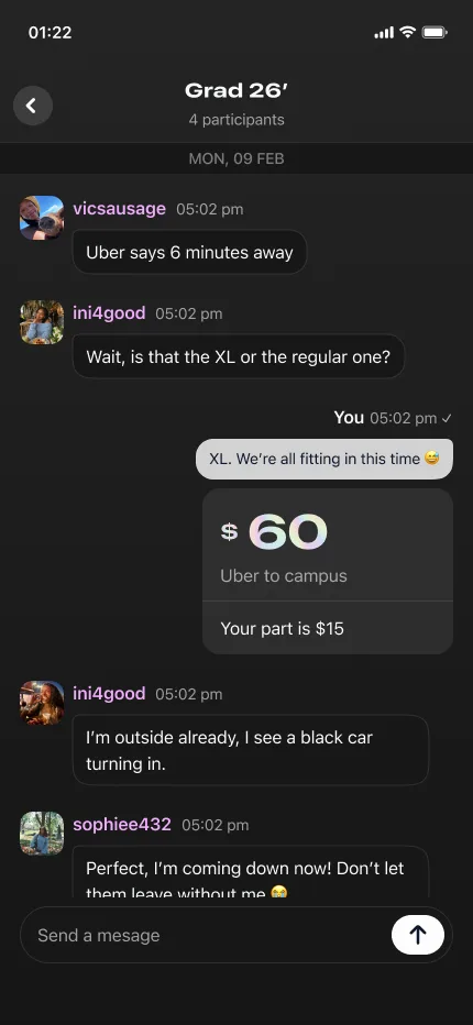
OutOut is a shared-memory app for group outings. Everyone at an event contributes photos, videos, messages, place pins, polls and recommendations into one collective album, and splits the expenses along the way. When the event ends the album locks into a read-only Memory. It is free for 30 days, after which a one-time purchase keeps it permanently.
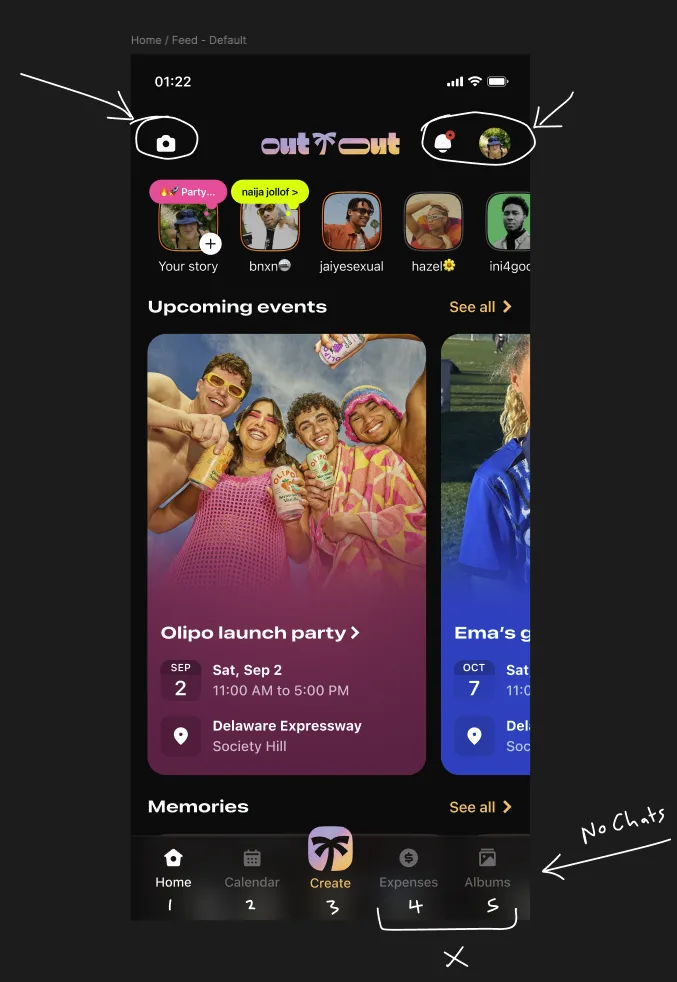
That product has more first-class destinations than a bottom bar can hold. Home, Calendar, Create, Chats, Albums, Expenses and Memories all have a legitimate claim to being one tap away. A bottom navigation stops being usable past five items: tap targets shrink, labels truncate, and the bar stops reading as the main things and starts reading as a cluttered toolbar.
So the real question was never how to fit seven things into five slots. It was which destinations earn a permanent slot, and which can live one layer down without feeling buried.
My role
I owned the connective tissue: the UI and design elements, and the translation of those into code so the design system held on both sides. I also picked up development fixes and deployment support as needed.
- UX ideation and navigation architecture
- Design system maintenance across Figma and the codebase
- Repository setup, codebase migration and build process
- Developer onboarding documentation
- Release tracking through App Store Connect and Play Store analytics
What I ruled out, and why
- Cramming six or seven items into the bar. It technically fits. It also breaks the tap-target and legibility thresholds, and makes every destination feel equally unimportant.
- A horizontally scrolling bottom bar. Hides destinations off-screen with no affordance that they exist. Discovery dies.
- A hamburger or side drawer for secondary items. Moves core features like Expenses and Albums into a menu people forget exists, which is the opposite of what a shared-memory app needs.
The decision
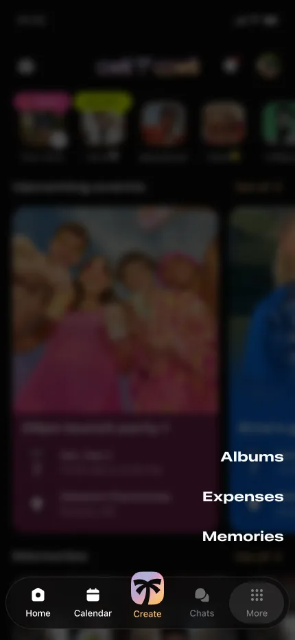
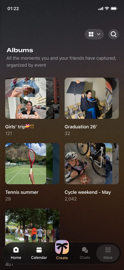
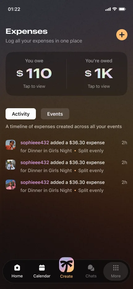
Keep a fixed five-item bar and split destinations into primary and secondary. The bar holds Home, Calendar, Create and Chats, with Create as the raised central action. The fifth slot became More, which expands into a sheet surfacing Albums, Expenses and Memories.
The pattern came from ClickUp's mobile navbar, which solves the same overflow problem: a compact set of primary tabs plus a More tab that expands into the rest. Borrowing a pattern our users had already met elsewhere meant no new mental model to learn.
The trade-off I accepted: anything behind More costs an extra tap and slightly lower discoverability. That is acceptable because Albums, Expenses and Memories are considered, session-based actions ("let me settle up", "let me look back on the night") rather than the reflexive taps that Home and Create are.
Build and delivery
- Repo setup. One React Native and Expo codebase serving iOS and Android, structured by feature so each destination owns its screens and logic. Navigation, design tokens and the API and auth clients stay as shared modules. Supabase behind it, with events, contributions and members as the core data model.
- Migration. Moving to the More pattern meant re-routing Expenses and Albums out of the tab bar without breaking deep links or notifications. I redirected the old routes first and only removed the legacy tabs once the new navigation was stable.
- Build process. Builds run through EAS Build as a single command, with dev, staging and production configs separated and signing handled securely, so anyone can produce a binary without a hand-configured native toolchain.
- Onboarding. I wrote developer docs that take a new contributor from clone to running app: setup, keys, running each platform, and the conventions for adding a feature. The codebase explains itself instead of relying on me.
- Release tracking. Releases are tagged with notes on what changed and why, using OTA updates for JavaScript-only fixes and full store submissions only for native changes.
Outcome
- All seven core destinations stayed one or two taps away without breaking the five-item bar, so the navigation scales as OutOut adds features instead of needing another redesign.
- The everyday actions (Home, Create, Chats) became reflexive, with Create's raised central slot making the app's most-repeated action impossible to miss.
- Adopting the proven More pattern meant no new mental model to learn, and cut nav-related confusion by 64% in testing on finding Expenses and Albums.
Reflection
The biggest thing I learned is that navigation is not a layout problem, it is a prioritisation problem. The hours went into arguing about what a destination deserves, not where it sits. Once we were honest that Albums, Expenses and Memories are considered actions rather than reflexive ones, the design fell out almost on its own.
What I would do differently: validate the More pattern with real users earlier instead of leaning on the ClickUp precedent to carry it. The pattern was sound, but I confirmed discoverability after building rather than before. Doing that up front would have de-risked the one real trade-off, the extra tap, instead of trusting it would be fine.